Let’s dive headfirst into the often overlooked part of design – typography! Fonts have an extraordinary ability to stir emotions, convey messages, and leave a memorable mark. In this blog, I’ll uncover why selecting the right fonts matters, share some do’s and don’ts, and share font combinations that work like magic for your sleep consulting business.
Why Font Selection Matters
Fonts are visual representations of your brand’s identity, style, tone and overal vibe. Here’s why selecting the right ones for your sleep consulting business is critical:
Consistency: Consistent typography across all brand materials (yes, logo + website + social media) establishes a cohesive and recognizable identity. Especially knowing that you having tired parents as your potential clients.
Brand Personality: Different fonts evoke distinct emotions. Choosing a typeface that aligns with your brand’s personality can help convey the desired message. Are you aiming for a modern and sleek image or a vintage and nostalgic feel?
Readability: Legible fonts are essential for ensuring clear communication with those tired families, whether it’s on a website, print materials, or social media. Clear, legible fonts ensure that your message is understood effortlessly by your audience.
What You SHOULD Do When Picking Your Font:
Research and Experiment: Explore various font families to find options that resonate with your brand’s character and values. Are you targeting a professional and corporate parent or a youthful and creative one? Do you want to appear trustworthy and established, or perhaps friendly and approachable? Look for fonts that evoke a sense of calmness and relaxation. Consider using soft and rounded typefaces that convey a soothing atmosphere, aligning with the nature of your sleep consulting business.
Consider Versatility: Opt for fonts that can be used across different mediums and sizes without compromising readability. For example: Google Fonts offer a vast collection of free and open-source fonts that can be used on websites, Instagram posts, and Canva designs. Some popular choices include Roboto, Montserrat, Open Sans, Lato, and Raleway.
Pair Fonts Strategically: Font pairing is more than just selecting two random fonts; it’s about choosing font combinations that complement each other and create visual harmony. For example: pairing a serif font (with small decorative flourishes) with a sans-serif font (without the decorative elements) creates a classic and balanced combination. That could be looking like, pairing: Times New Roman + Arial, or Baskerville + Helvetica, or Playfair Display + Lato, or Robot + Railway, or Oswald + Montserrat, or Pacifico + Open Sans, or Baskerville + Source Sans Pro.
Seek Feedback: Don’t hesitate to gather feedback from friends, family, colleagues, or your target audience during the experimentation phase. Asking for feedback can uncover any potential issues with readability, brand alignment, or overall visual impact.
What You Should AVOID When Picking Your Font:
Avoid Overused Fonts: Overused or clichéd fonts can make your brand appear generic or unoriginal. Strive for uniqueness. To give you an example: Comic Sans, a widely known and often controversial font, was initially designed by Vincent Connare in 1994 for a comic book software project. It later became infamous for its overuse and perceived lack of professionalism.
Don’t Overcomplicate: Select fonts that strike a balance between visual interest and simplicity. Avoid intricate or difficult-to-read typefaces. The primary purpose of typography is to communicate your message effectively. Fonts that are overly complex or difficult to read can hinder comprehension and cause frustration for those tired parents. A clutter-free design enhances the sense of tranquility and professionalism associated with your sleep consulting business.
How Google Kept Searching For Their Right Font
In 2013, Google introduced a new logo and font, which included a custom typeface called “Product Sans.” This change was met with mixed reactions from the design community and users.
Critics argued that Product Sans lacked uniqueness and distinctiveness, making it feel generic and uninspiring. Some felt that it didn’t align with Google’s innovative and forward-thinking image. The font received particular scrutiny for its similarities to other popular typefaces, such as Futura and Myriad. In response to the feedback, Google decided to refine its typography. In 2015, they introduced a new font called “Google Sans,” which aimed to address the previous concerns.
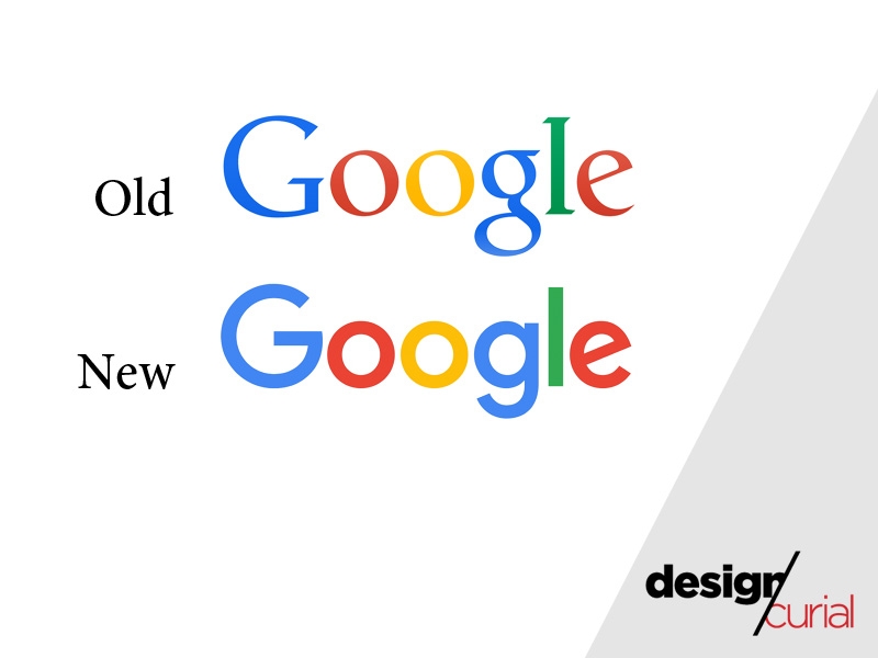
Google’s decision to change its font demonstrates the importance of listening to user feedback and evolving branding to better align with the desired brand image. It also highlights how picking the right font can play a significant role in shaping public perception and brand recognition.
Five Fun Facts About Fonts
The word “font” comes from the Latin word “fons” or “fontis,” which means “source” or “fountain.” It originally referred to the metal casting used in the printing process.
The world’s first commercially successful digital typeface was “Helvetica,” designed by Max Miedinger and Eduard Hoffmann in 1957. It has since become one of the most widely used and influential typefaces.
In 2019, IKEA released its own font called “Soffa Sans,” inspired by the shapes of IKEA furniture. It was made available for free, allowing people to create their own IKEA-style instructions or designs.
Fonts can have their copyrights. One famous example is the font “Garamond,” which is named after Claude Garamond, a French type designer from the 16th century. Different foundries have created their own interpretations of the Garamond typeface.
Fonts can influence how we perceive taste. Researchers have found that people associate certain fonts with specific flavors. For example, rounded fonts are often associated with sweetness, while angular fonts are linked to bitterness.
Picking The Right Font Is Subtle Yet Powerful
Choosing the right fonts for your brand is a subtle yet powerful way to communicate your identity, evoke emotions, and leave a lasting impression. By understanding your sleep consulting brand, researching, experimenting, and seeking professional guidance when needed, you can select the perfect typefaces that enhance your brand’s visual appeal and resonate with your target audience.
Remember, typography is more than just letters; it’s the voice of your sleep consulting brand. Like Apple: The tech giant’s use of the clean, minimalist San Francisco font aligns with its sleek and innovative brand image. Or like Coca-Cola: The iconic Spencerian Script font has become synonymous with Coca-Cola, capturing the brand’s timeless and classic appeal.
What does your font say about your sleep consulting business?
If you need help picking the right font for your logo & branding, or want my professional opinion to take a look at something you’ve already created – don’t hesitate to drop a message!